Sometimes CG cinematography does get recognition.
Animated films deserve a place in the conversation about modern cinematography just as much as any live action movie. Slowly, but surely the world is starting to warm up to that idea. With CG-heavy films like “Avatar” (2009), and “Life of Pi” (2012) getting cinematography recognition, it’s only a matter of time before CG-only films reach the same level. In 2014, Sharon Calahan was admitted to the American Society of Cinematographers for her work as an animation Director of Photography. Back in 2005, cinematographer Roger Deakins began working as a visual consultant on animated movies, helping to bring a live action cinematic aesthetic to the virtual world.
In some ways I think of animation as the ultimate test of a cinematographer because you don’t have the real world to rely on. In The Verge’s interview with Wally Pfister of “The Dark Knight” (2008) fame he says, “If you’re shooting a practical location, I think you’d be foolish not to walk in and see what inspires you.” There’s something daunting about approaching an animation without that practical inspiration. But by putting an emphasis on what the DP’s imagination can conjure up, the stage is set for some unique photography. In an interview with the FD Times, legendary cinematographer Vittorio Storaro says, “It is often impossible to recognize the creativity of different cinematographers, as many of them don’t even try to have their own personal visual style.” He makes an indictment of the overuse of naturalistic lighting and essentially criticizes the very approach Pfister has made a career out of. In Storaro’s mind every film needs to have a one-of-a-kind aesthetic that is suitable particularly for its story. That can’t be achieved if we’re looking to naturalism to inform our lighting style–it also kinda explains why every indie film looks the same. Animations don’t have any natural light to be inspired by so it becomes the perfect place for experimentation.
Sometimes the question is "Why?" Other times the question is "Why not?!"
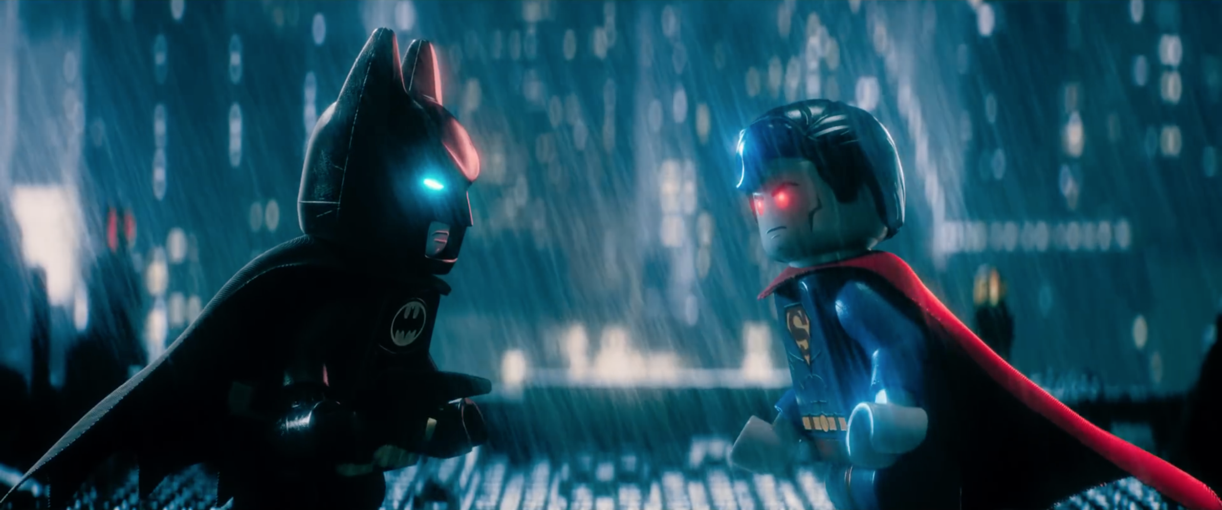
It’s clear that “LEGO Batman” completely foregoes all sense of naturalism in a huge amount of the film. The night skies are often filled with deep orange light, sometimes the streets are bathed in green. The image is filled with stark and colorful contrast that’s by and large foreign to a typical day exterior. It’s refreshing to see how they manipulate the lighting to create an environment that only exists in this movie, at least partially because they’re not constrained to the limitations of reality. The sky doesn’t have to be blue because it can be any color the artists want.
If the lighting looks artificial, how exactly does that add to the experience of watching the film? In cinema we have plenty of modes of communication with the viewer like dialogue, sound design, music, editing, performance, and production design. These modes each do their part in feeding the audience with information about the themes, characters, and emotions. When taken together they can create powerful experiences. If you were to pull lighting out of the equation the audience would still have enough detail to get a strong sense of what the filmmakers are trying to say. In order for lighting as merely one mode of communication to add meaningfully to that conversation it has to be incredibly specific to a particular moment in a particular film. As established in “The LEGO Movie” (2014), technically all the events of this film are happening on some kid’s tabletop in a basement in suburbia. The hyper-stylized lighting (perhaps subconsciously) reminds us that everything we’re seeing is being filtered through that kid’s imagination as he plays with his toys. That’s a level of specificity you can’t achieve with natural light regardless of how beautiful it is.
Red everywhere.
On top of that, there’s so much tone and style delivered to us by way of lighting. It’s undeniable that we can pick up details on who this Batman is by how his mansion, his batcave, and his Gotham are lit. We understand his callous, self-centered demeanor by how dark and shadowy his world is. We get a sense of the glamor and carelessness that he fights crime with by how gaudy everything is around him. Not least of which is the constant, beaming red lighting that seems to surround Batman, making a mockery of the danger he’s getting into. The key here is that the lighting is not simply serving a technical role by creating the illusion of reality. In an interview with American Cinematographer, three time Academy Award winner, Robert Richardson, says “I don’t look to motivation as a guide in how to light a sequence. It’s not that I don’t utilize motivation, but I’d say my philosophy is more emotionally or psychologically driven.” The same philosophy applies for “LEGO Batman.” The lighting appeals to something innate within us. That’s how it talks to us.
I don’t want to say that natural lighting is bad because there have been countless movies that used it and made it work. Rather, I want to say that it’s becoming increasingly neutral. Modern animations have a unique ability to stray from the norm and challenge us with daring lighting setups, but movies like “LEGO Batman” rarely get recognized for the achievements they’re making in the field of cinematography. It’s time to change that.
-Sheldon J.
P.S. When I saw the film there was definitely a "Directors of Photography" credit with a person for Layout and another for Lighting. I haven't been able to find those credits online, if anyone knows please tell me!


