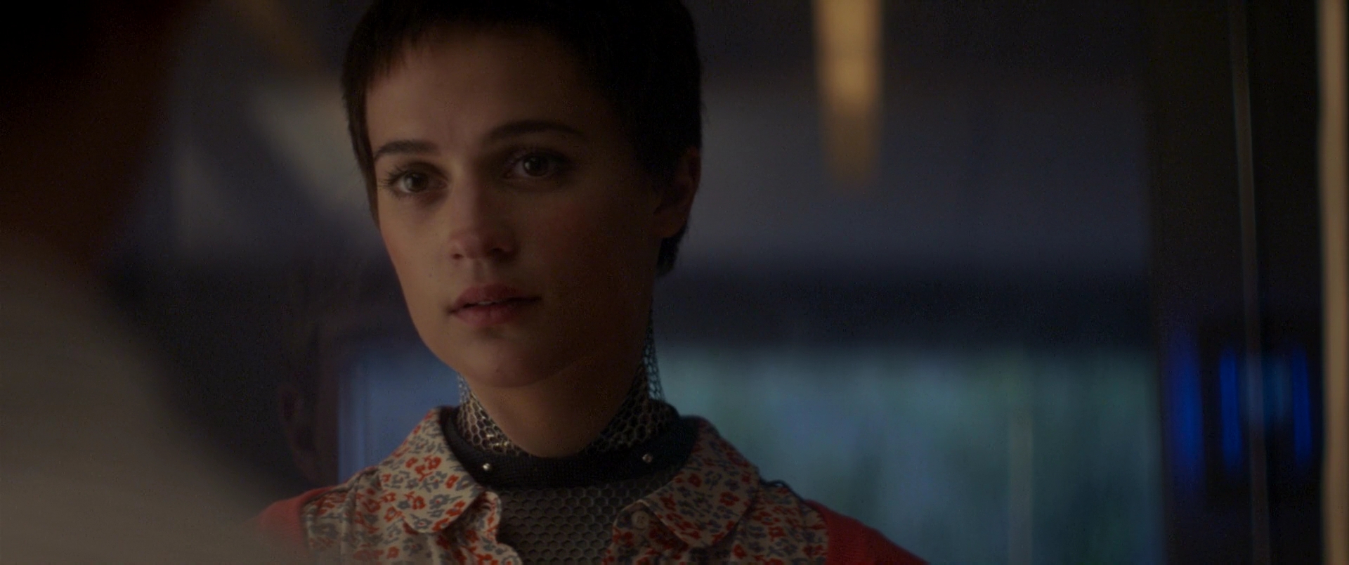
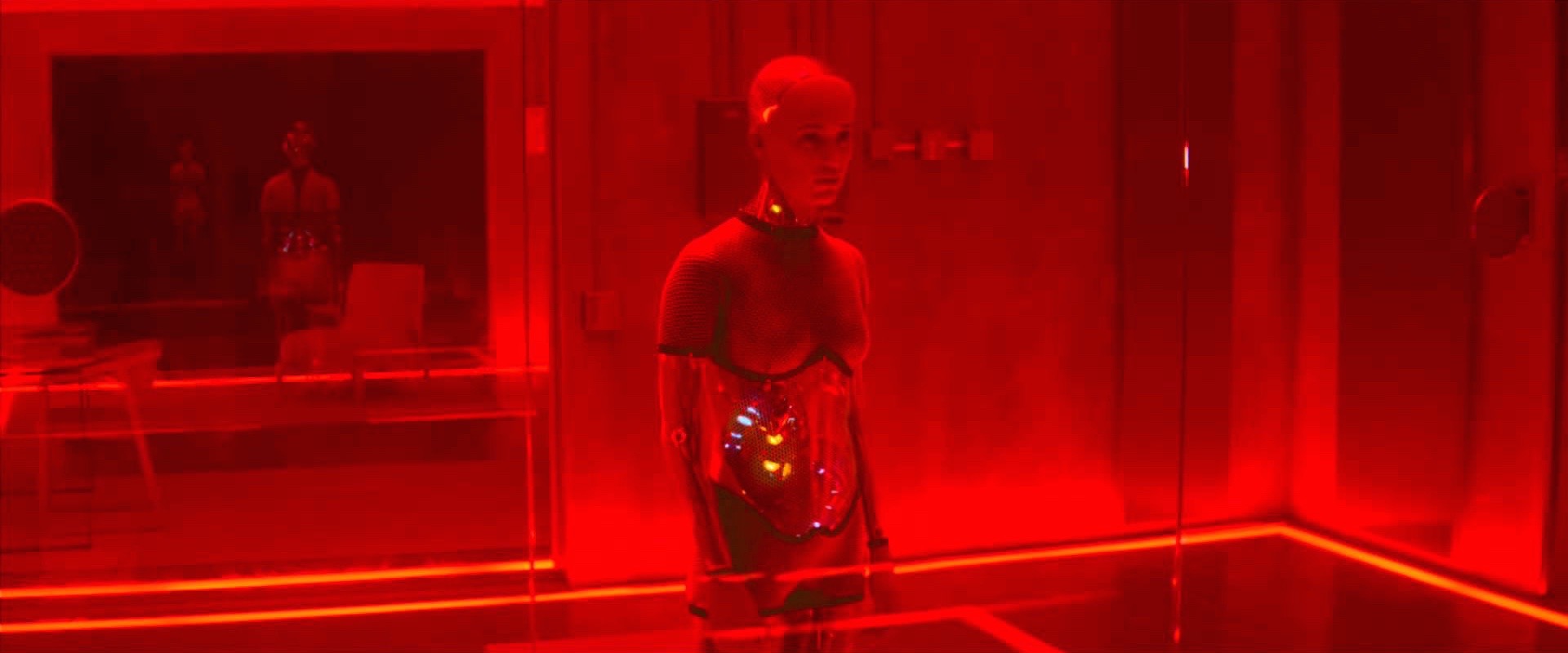
“Ex Machina” is one of those rare movies not shot on film, Arri Alexa, or a Red camera. Instead it was shot primarily on Sony’s top of the line cinema camera: F65 with some handheld work shot on the lighter F55. When the F65 was released, Sony proudly touted its formidable spec sheet; it was the only cinema camera boasting 8K resolution and it claimed to be capable of capturing a greater range of color than any competing digital sensor or even print film, giving cinematographers a wider palate to work with than ever before. On paper, it outperformed the industry leading Alexa camera. By many accounts the F65 was capable of delivering a high end image, robust enough to give the Alexa a run for its money, but the camera never seemed to catch on. I’d bet it’s because by the time the F65 was available Alexa already had a stranglehold on the market, and the F65 was actually a more expensive alternative. Over the few years that it has been available, it seems to have fallen into a bit of a niche market of sci-fi and futuristic films with movies like “After Earth” (2013), “Oblivion” (2013), and “Tomorrowland” (2015) on its résumé. “Ex Machina” falls right into that pattern with a technologically savvy film that revolves around the development of a truly sentient artificial intelligence system, embodied by a humanoid robot named “Ava.”
Beautiful anamorphic photography
Depictions of the future often tend to have a leaning toward a pristine look, compared to, say, period films that tend to be dirtied up with more grain. That makes the extra sharpness of the F65 ideal for these kinds of films. An interesting choice that cinematographer Rob Hardy made was to shoot primarily with Cooke Xtal Express lenses, which are anamorphosed Cooke S2’s and S3’s from the 1930’s and 40’s. It’s been a long standing trend since the influx of digital cameras into mainstream moviemaking to employ antique lenses that are noticeably softer than modern lenses in order to reduce the sharpness of the imagery. It’s also common that anamorphic lenses will be softer than spherical ones, so to use anamorphic classic lenses adds a noticeable amount of texture to the tack sharp F65. On the other hand, cinematographer Claudio Miranda insisted on achieving maximum sharpness for the movie “Tomorrowland” by using Zeiss Master Primes and Fujinon Premier Zooms, but that film made it clear just how displeasing that much sharpness can be on screen. I have to give Hardy some points for knowing when enough is enough and dialing back on sharpness. He even used ⅛ Black Pro Mist filters to soften close ups on Ava, to give her the impression of perfectly smooth skin.
Over the shoulder shot with both characters framed to the left.
I’ve been noticing that it’s becoming more common for movies to entirely break the rules of composition and go with some pretty nonstandard choices. Immediately, the Oscar-nomintaed film “Ida” (2014) comes to mind in how it used a great deal of headroom, or placed actors on the opposite side of the frame that conventional composition would dictate. Other movies that use similar compositions include “A Most Violent Year” (2014), and “Carol” (2015). “Ex Machina” also employs some unusual compositions particularly in some scenarios when coverage moves into over the shoulder shots. Instead of having the foreground character’s shoulder on one side of the frame, and the main character on the opposite side of the frame, they’ll frame it up so that both characters are pushed together on the same side of the frame. In theory, this would create a problem because the frame would lack balance with both characters on the same side, but I never got that feeling during this film. The reason is because there’s so much interest built into the sets. It kind of turns the idea of negative space on its head, because even in the area without the characters, there’s still so much going on. The production design is so unique and detailed, that there’s still something to balance the composition. This film is a perfect example of how closely production design and cinematography are related.
The lighting says it all in this shot.
From literally the first frame, Hardy already establishes the visual motif of reflections in glass. That would go on to heavily characterize the toe-to-toe between Ava and Caleb over the course of their testing sessions. The reflections would come to highlight the sense of voyeurism. As we watch Ava through the glass, we also see Caleb observing her, when the camera moves to Ava’s side of the glass, we get the reciprocal perspective. In that way, the camerawork relies on the set to make the frame work. Throughout the film, the lighting also heavily uses the production design. Some of the best and most refined lighting is practical lighting, that allows the light to emanate from the set. Usually we think about this as lamps scattered around the set, but Hardy takes it to another level. He places all these strips of light in the floors. He has soft and controlled light sources built into the walls. The lighting comes off as completely controlled and the best part of it is that not only does it illuminate the actors with beautiful light, but the sources themselves contribute to the aesthetic of the film. One of the best ways is that they add to the color palate of the sets. There’s often an orange, warm glow on the set, which is completely overtaken by the red emergency lights when Ava cuts out the power. When that happens Hardy is using the lighting narratively to inform us about what’s happening in the story and further defining the color scheme.
Particularly in those sessions between Caleb and Ava, we’re allowed to bear witness to a beautiful product of camera and lighting coming together. They draw the characters closer, offer us a point of view, create urgency and so much more. Overall Rob Hardy hits it out of the park on this one.
-Sheldon J.


