People go to see movies for a lot of reasons. In the case of "Fifty Shades of Grey," coming from a wildly popular book one would expect elements like the writing, the subject matter, or the enigmatic titular character to all be strong selling points. In contrast, the cinematography probably doesn't even occur to anyone, but that's actually part of why it's so interesting. What does the photography bring to the table when it's the last thing anyone cares about?
One thing is for sure, and it's that Seamus McGarvey is a master cinematographer. Having excelled photographing impactful period dramas like "Atonement" (2007) and "Anna Karenina" (2012); but also having made recent forays into blockbuster action films with "The Avengers" (2012) and "Godzilla" (2014) we see that he can comfortably dive into some diverse work. With that kind of résumé, we can all rest assured that McGarvey knows what he's doing even if we don't fully understand it ourselves.
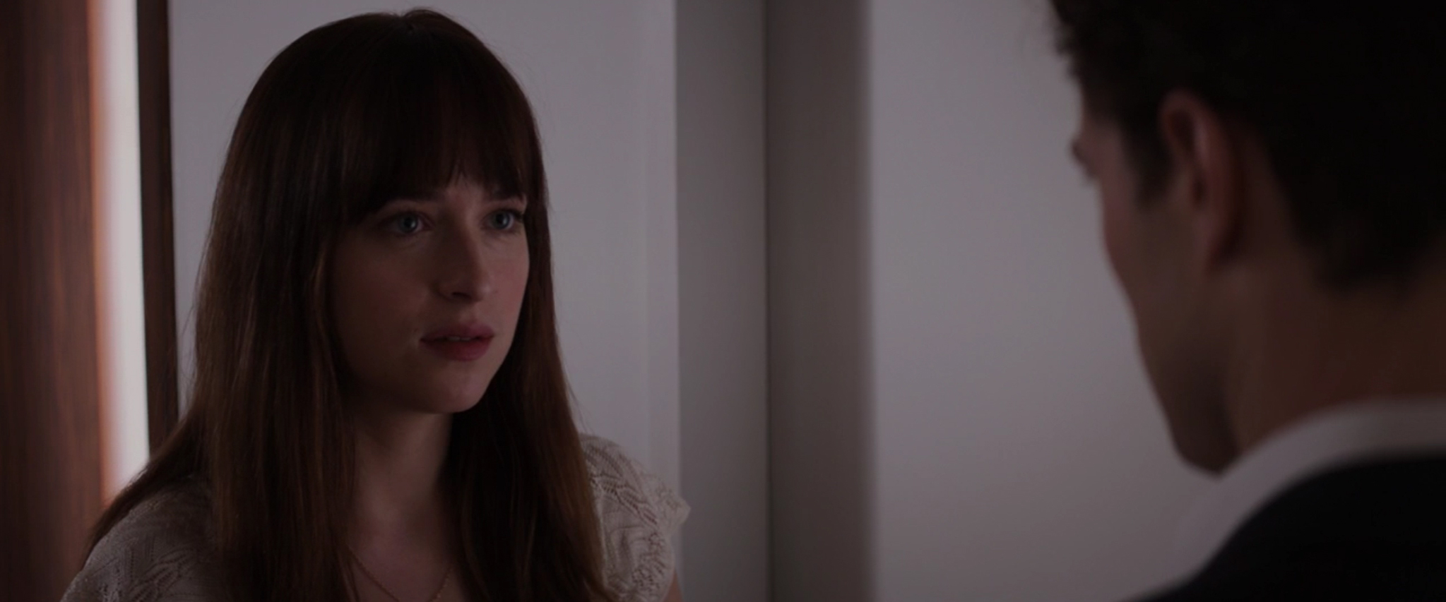
The way her nose shadow crosses her face right under her eye is normally a big no, but McGarvey embraces it.
Obviously sexiness is kind of a key part of anything "Fifty Shades" related, and consequently the burden falls at least partially on the cinematographer's shoulders to ensure that our lead actors are looking good all the time. You can't just have shots popping up in which Anastasia looks like she forgot to take a shower that morning. Of course the actors always look their best in the film, but the surprising part is exactly how McGarvey achieves a sense of beauty here. Looking attractive is a subjective concept, but it's usually associated with a high key light with the shadows falling in pleasing areas of the face. In the glamorous days of the 30s black and white photography, actress Marlene Dietrich was famous for demanding she had a high key light. McGarvey on the other hand completely changes things around and actually employs a great deal of low angle key lights on Anastasia's face. The remarkable thing is that it's always still gorgeous. High angle lighting is the norm because in life most light sources we encounter come from above. The sun and the sky are always above us and when we move indoors the lighting is usually overhead. Low angle lighting is usually considered spooky; it evokes the trope of putting the flashlight just under one's face for telling ghost stories (this in itself is probably an exaggeration of the low angle light you get when sitting around a campfire). To adopt low angle light into a film with such a clear mandate on beauty is almost absurd, but in this case it actually turns out to be just crazy enough to work. I really couldn't say why, I guess we'll chalk it up to numerous layers of diffusion and good makeup.
Another example of the very present nose shadow.
Other than the fact that it's just brazen and cool, the reason why I find the low angle light to be such a brilliant choice is that he manages to cover all his bases by still engaging the lighting as a storytelling tool. In an interview McGarvey once discussed his work on "The Hours" (2002). Meryl Streep was unsatisfied with the way she looked on camera and in order to please her and the studio, McGarvey started lighting her with softer sources and introduced diffusion filters even though he didn't feel that it was appropriate for the story. In this case, I doubt he would've made it past the first week if Dakota Johnson didn't look good on screen, but he does start to indicate that the film will delve into some darker themes and characters using the placement of the light sources.
In this scene, McGarvey lets the lighting do the talking.
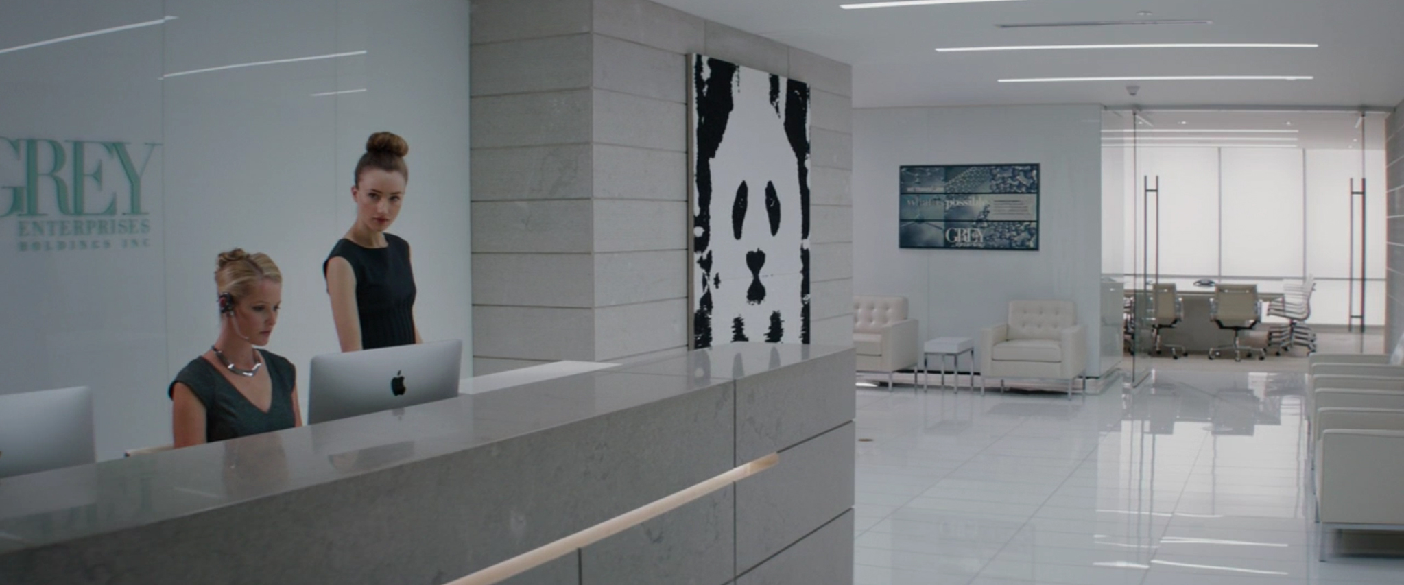
The pristine lobby to Grey Enterprises.
That's not the only way he takes advantage of the possibilities of lighting. The way he uses color throughout the film works toward tempering out the emotional rhythm of the narrative. Given the famous "Red Room" and all that it stands for, the reds and warmer tones are reserved for passionate moments. One of the best uses of color is when Anastasia calls a business meeting with Christian to iron out the details of their contract. This is the kind of scene that really lives in the subtext. There's a lot that's unsaid and the lighting helps to put us in their mindset. We understand that there's something simmering under the surface because of the environment that McGarvey puts them in. That consistency in allowing the lighting to define the environment adds a great deal of subtlety to the photography. One of the great techniques he employs early on in the film is building the lighting into the sets at Grey Enterprises. It has a modern, sleek, monochromatic (it is called Fifty Shades of GREY after all) feel, and the light emanating out of the walls does a lot to help us understand what kind of place Anastasia is walking into. The abundance of light makes it seem pristine; there's an air of perfectionism to the space that makes it almost larger than life. By the time we get to her first sit down with Christian we understand the power imbalance facing their relationship that will carry throughout the rest of the film. Another great little accent that McGarvey adds to this sequence is his use of wide angle lenses, which only show up very sparingly throughout the film. The way wide angle lenses exaggerate the size of the space adds a little more oomph to the scale of Grey Enterprises.
You can tell the wide angle Panavision C-Series lenses by the very obvious barrel distortion.
Emphasizing the right moments is key.
Director Sam Taylor-Johnson comes from a photography background, and it's clear to see that the combined compositional prowess between her and McGarvey made for some strong shot choices throughout the film. It's always nice when a film has engaging wide and establishing shots, but going beyond that, their real accomplishment was finding the intensity in some of the later scenes. When the story moves into the Red Room and they put us right there experiencing the anticipation of what a "punishment" from Christian Grey entails, they move the camera in close and capture the right details to make the scene work. This is all helped along by McGarvey's choice of Panavision anamorphic lenses, which offer an extra nudge of elegance to the imagery. Taylor-Johnson once expressed that this is a film about control, so it follows that the camera should also be under control. This is why the camera movement is characterized by precise dolly moves rather than handheld or steadicam shots and it completely works.
As I said earlier, these aren't the things that people are really looking out for when they walk into the theater to see "Fifty Shades," but imagine how much the film would have suffered without the top notch cinematography. Imagine if there was flat, uninteresting lighting or lazy, handheld camerawork. We would have lost all the beautiful undertones that McGarvey brings to the film that completely affect how we perceive it. We would have lost the the very thoughtful color arc that develops over the course of the film. And of course, we would have lost the impactful compositions that go a long way in telling the story of these characters.
-Sheldon J.


