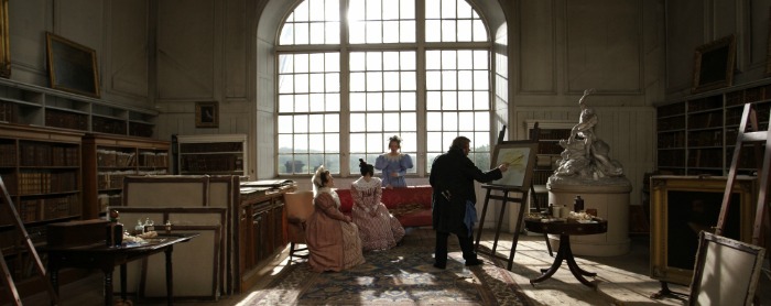
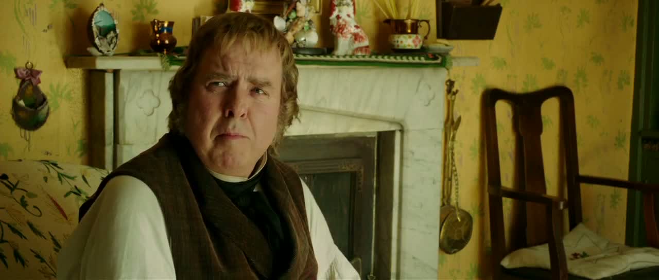
I've been hearing a lot of hype over the cinematography of “Mr. Turner” and I fully expect it to be nominated for an Oscar (or at least an ASC award). It only figures that a film about a renowned painter, would become highly acclaimed for its photography. The term “painterly” keeps getting thrown around regarding Dick Pope’s work, which I feel like I could’ve predicted before even seeing the movie. Of course while watching the film I saw that it had some really beautiful shots. There were amazing vistas beginning with the very first image on screen. Pope made the sets sing with his lighting and all was happy and good in cinematography world. Yet sometime after reflecting a bit on the film, I started to wonder whether this effort was exactly what was to be expected.
When I think about it, I can’t really find something that sets this film apart from any films similar to it. What did Dick Pope do here, that Janusz Kaminski didn’t do for “Lincoln” (2012) or even John Alcott for “Barry Lyndon” (1975)? All three of these films were actually lit for the most part in pretty much the same way with big lights coming in through the windows and grip equipment on the inside to control the spill. It’s a pretty standard approach, so the question becomes: how much do we really value novelty over beauty in cinematography? I think we can all agree that if someone manages to achieve both of those, she pretty much wins at life. If a cinematographer only manages to achieve one of the pair, on the other hand, what does it even mean?
"Mr. Turner" on the left and "Lincoln" on the right. Just add fill and voila!
What I’m trying to get at, is that any working cinematographer right now could have shot “Mr. Turner” in more or less the same style as Pope without even much thought. Often it’s not the implementation of a style that’s the creative or impressive part of cinematography, but rather the choice to implement it. For example, it probably wasn’t very hard for Spielberg to shoot “Saving Private Ryan” (1998) or “Schindler’s List” (1993) mostly handheld as opposed to on a tripod, but the vision and creativity that went into the choice to do so is what makes it spectacular. In the case of “Mr. Turner,” the choice to light everything through the windows is just painfully obvious because it’s already been done a million times. It’s the no-brainer choice. He approached the film without even the slightest risk, so how commendable can his work really be?
Maybe the film doesn't require anything special, but then is it even an achievement?
His working relationship with director Mike Leigh, also leaves me rather skeptical of how great his cinematography is. Leigh would hold off on having any sort of solid script until he could spend some time with the actors improvising on the actual set. They would then take what they liked out of the improv, make a script of it, and present it to the crew, Pope included. Only then would they decide on the shots, in a sort of “make it up as you go along” fashion. In the end, the compositions are never anything interesting. The camera work is solid of course; I didn’t notice any blunders, but that’s about it. They didn’t put a great deal of care into their shot selection and it shows. What actual professional cinematographer can’t point a camera at a beautiful vista and get a beautiful shot? As a matter of fact, I think most instagrammers could pull that off, so shouldn’t we expect something more?
-Sheldon J.


