Here we have a movie that’s become a veritable classic. Its remarkable science-fiction visuals have no doubt been an integral part in solidifying its standing as a seminal work. It’s super easy to look at a scene from the film and immediately take it at face value. Beautiful shot after beautiful shot permeate the movie, but that’s not what this blog is about. We can really take an analytical look at what makes these shots beautiful, what makes the cinematography unique, and what kind of techniques are being employed to provide its iconic look.
I once worked on a small shoot in which the DP had only three lights at his disposal: a large softbox and two Kino Flos. The DP addressed his lighting crew at the top of the day by making it clear that they’d be “painting with broad strokes.” That didn’t necessarily mean the quality would suffer, but rather that they’d be taking a more relaxed approach to the lighting. They couldn’t expect to get particularly specific with what they are and aren’t lighting, but they still always found an interesting way to place their three sources. They took what they had and made it work. “Blade Runner” does the same thing, but the difference is that they had immense resources. Part of what makes this work so impressive is the way Cronenweth implements just about every means of manipulating light in a way that feels so pure and organic to the setting.
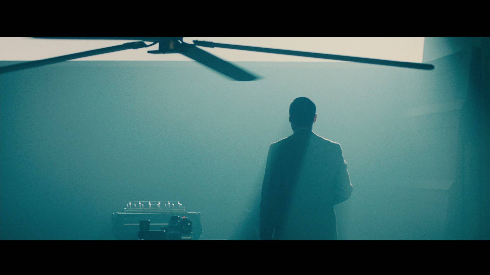
Bold color choice and heavy smoke.
Sometimes there are big bold color choices, such as the first time the Voight-Kampff test is administered in a blue, sterile-feeling room, compared to the second time in front of a low sun, providing a warm cast over the scene, not to mention more “theatrical” colors present in the exteriors or in the driving scenes. He also does a lot of work with the quality of the light, often mixing many hard and soft sources. Sometimes lights even move or change in some dimension during a scene. The Xenon spotlight sources that they use throughout the film to cast shafts of smoke are a great example, or when the blinds come down before the second Voight-Kampff for the practical cause of creating appropriate lighting conditions for the test, but also creating a great atmosphere for the scene. They even work with breaking up the light with patterns on walls, such as Venetian blinds, or smoke in some cases. The movie uses such a broad range of manipulations that it serves almost as a textbook of lighting techniques.
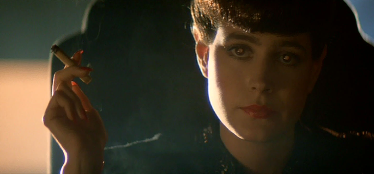
One of the great subtleties that Cronenweth works with continuously is the brilliant eye light for the replicants. They wanted an eye light that appears to come directly from in front of the lens, to put the reflection right at the center of the pupil. Of course they couldn’t put it actually in front of the lens because it’d be the biggest thing in frame, so they set up a 50/50 beamsplitter (that’s a glass that reflects half and transmits half of the light) at a 45 degree angle to the camera and punched the eye light into the glass, so that its light would hit the subject after being reflected. In turn, the camera looked through the beamsplitter to allow both the eye light and the lens to appear to be on the same axis. When you watch the film, you’ll see that often the replicants have a large reflection in their eyes, which serves as a bit of a “tell” when it comes to figuring out who’s a replicant and who’s not. If that’s not a great example of the cinematography telling the story, I don’t know what is.
The replicants have a very distinct warm eye light.
The question then becomes, which is a more valid means of photographing a movie. The minimalist way that the DP on the small shoot employed, or the ultra-detailed and maniacally specific way that Cronenweth shot “Blade Runner?” I think there’s room in the world for both. There are going to be films out there that are just better off without all the bells and whistles. Sometimes a story doesn’t call for all of Cronenweth’s precision, and yet the attention to detail is certainly more difficult. If nothing else, that makes it more commendable. Of course you can use three light sources in a way that can effectively tell a story, but it’s going to be almost impossible to orient them in a way that is truly impressive and shows a unique vision. That’s why the complexity of Cronenweth’s photography is such an achievement. When D. W. Griffith was making films he could be impressive just by cutting to a close-up, but the standards are higher in the modern era. Cronenweth proves that he can pull out the most advanced techniques in showing audiences something completely novel with his depiction of dystopian Los Angeles.
Also a fun fact: Cronenweth’s son, Jeff Cronenweth is also a DP, you might know him from his work on David Fincher’s films, “The Social Network” (2010) and The Girl with the Dragon Tattoo (2011), both of which were nominated for Oscars for cinematography.
-Sheldon J.

